
By Vitalik Demin
In the last few months I’ve seen quite a few tweets that talked about icons and how a lot of current designs have an opportunity to become a lot clearer than they are today. I saw some good examples of that too. There’s nothing new here though, the world of icons has been broken for a long time and there’s really no end in sight. Let’s take a quick look into a couple of assumptions from icon designers and what actually happens in reality.
Icon Mistakes Begin With Assumptions
Assumption number one that is often made by UX designers is that icons don’t need names next to them. This can only be true in cases when icons are truly universal, have been there for a long time and are really clear visually. Good examples are – an envelope icon for Mail, a trash can for Delete, or a camera icon for, well, Camera app, etc.
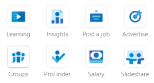
But most of the new and “creative” icons are still very confusing to users and unfortunately have been spreading like mushrooms lately. Take, for example, a set of some current LinkedIn icons below and imagine if there were no names under the them? Would you ever understand what most of them mean?
Assumption number two that occurs a lot these days is the fact that designers believe that even if their icons are potentially slightly vague, users should have no problem learning them and get used to them after one or two times of using the product.
While in some corner cases in may be true, in all others it’s not. I have a great example for it. Remember how Dropbox used to have the “Plus sign” icon for many years? Under this button you could upload photos and scan in documents but you couldn’t add a folder.
Instead of adding this function to that button, they moved it to a three-dot menu icon on the opposite end of the screen. Every single time – and I am not exaggerating at all – every single time I used the app and I needed to add a folder, my brain struggled for 2-3 seconds before I remembered that the design was messed up and that the folder add was actually in a different place.
It was so counterintuitive that I couldn’t believe it. I wrote them many times about it, I mentioned it in my ebook. Finally, a few months ago, the made it right after so many years. You can now add a folder from the Plus icon. This example shows that certain things cannot be learned and that certain user behaviors cannot be changed, even through (miserable) repetition.
Lastly, every time users are exposed to confusing and counterintuitive navigation graphics, it creates friction, and friction is physical. It’s a material process that originates within our heads. Neurons in our brain receive, process, and transmit the information about our struggles with specific user interfaces and apps and it leaves a physical trace in our subconscious mind.
It’s not something we can articulate out loud. For example, we wouldn’t find ourselves saying something like “Yeah, every time I fire up this app my brain struggles with this plus button”. It simply gets recorded in the back of our heads and has a direct effect on the subconscious perception of that particular product.
Testing, 1,2,3….
So, think twice (and probably more than twice) before installing icons into UI. Test them extensively. Show it to many different people who have no idea what your product does. If at least someone says “What’s this icon for?”, it’s a red flag and needs to be addressed.

About Vitalik
Vitalik is a product design and business model professional from Minneapolis who loves building elegant and simple to use software.
Web: vitalikdemin.com
Twitter: @UXWithin
Instagram: @UXWithin
Editor’s note: Vitalik also has written several excellent e-books, which are well-worth a read.