
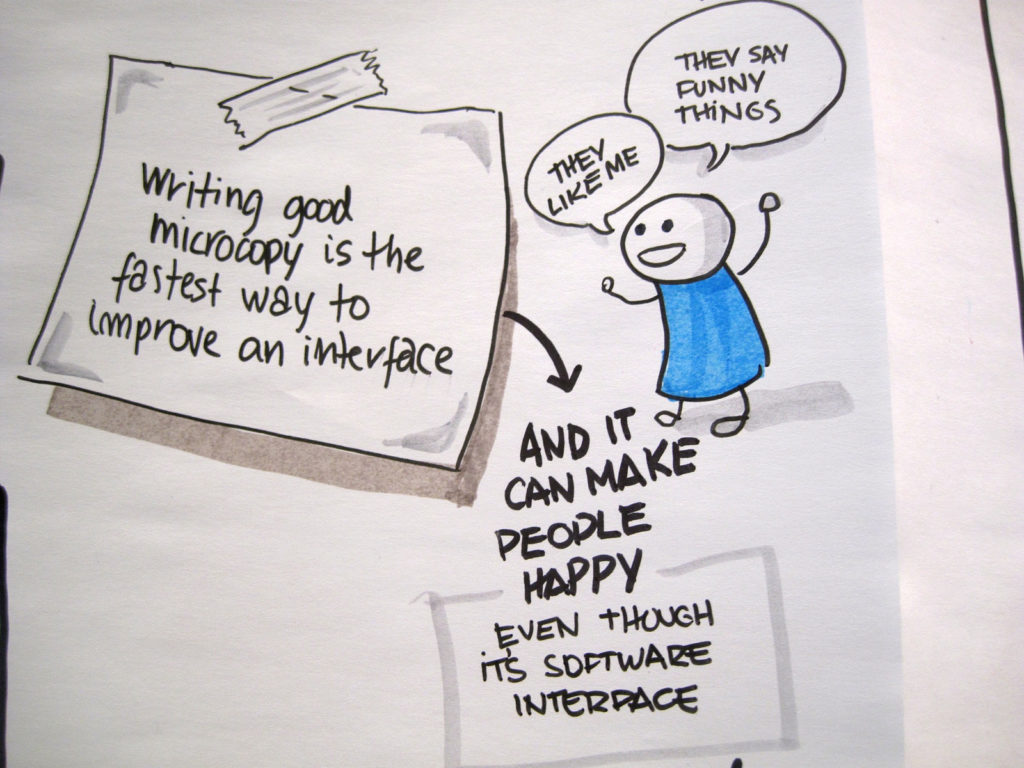
What Microcopy Is (and Why it Matters for UX Design)
Kinneret Yifrah (founder of Nemala, the leading UX writing studio in Israel, and author of Microcopy: The Complete Guide) defines microcopy as “the words or phrases in the user interface that are directly related to the actions a user takes.” This includes the text that drives users to take a specific action or navigates them through the necessary steps to complete that action, providing on-screen feedback along the way. For example, when you sign up for a Mailchimp account you’ll see a form that gently nudges you to register because there’s so much you can do with a free account. You also get helpful hints for creating a strong password for your account: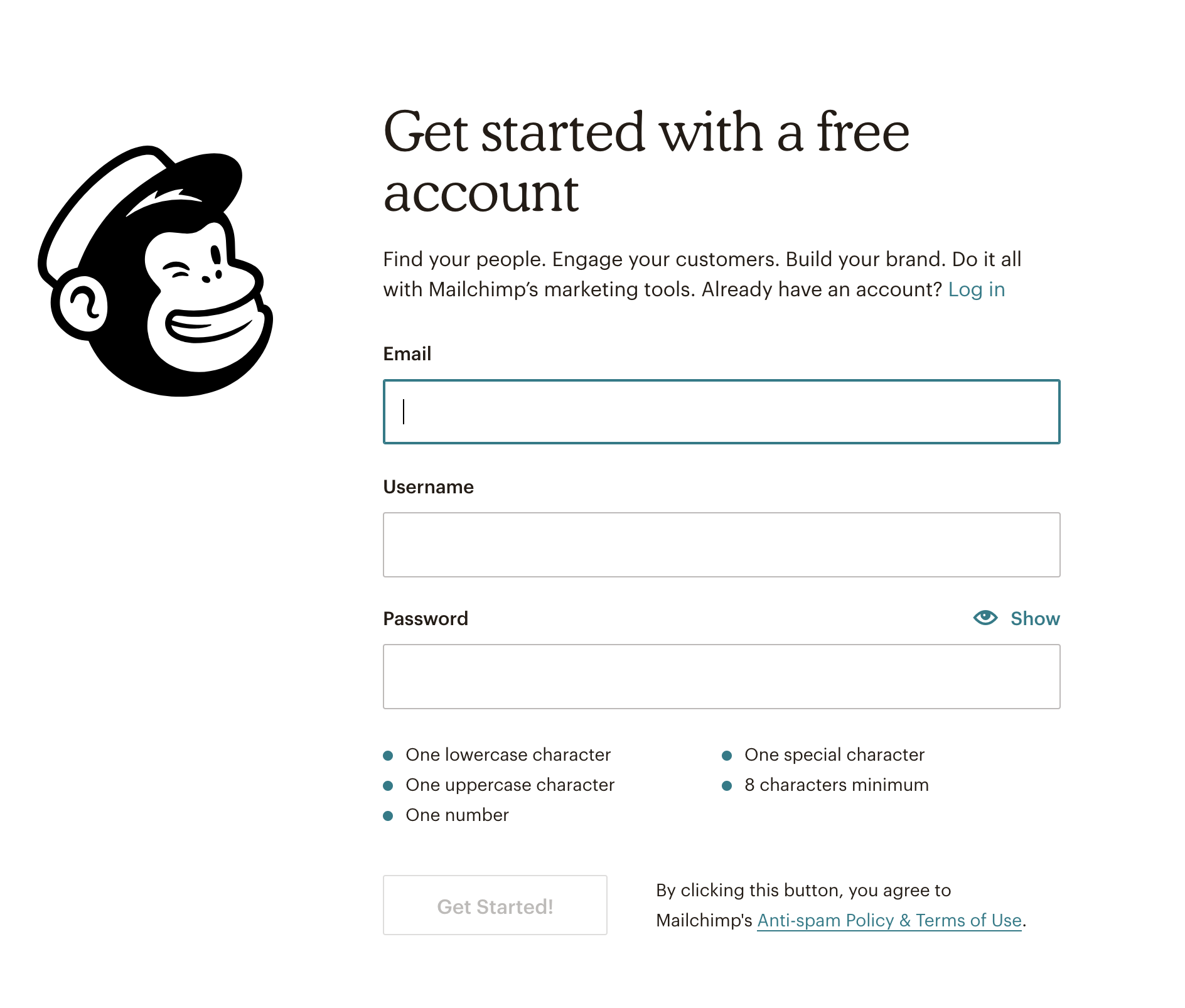
Mailchimp’s friendly signup form new customers will see upon registration.
So, microcopy is any short sentence and phrase we use to help navigate our users when they are trying to accomplish a goal on our product’s interface. It can help convince users to try out an app because of its easy and no-pressure trial process. It can reinforce the feeling of security during an online transaction. Microcopy can even alleviate pressure in an opt-in form, emphasizing that you can easily unsubscribe with a single click. That’s all great, but… isn’t microcopy a subcategory of UX writing then? And what about microcontent – what’s the connection there? While UX writing and microcopy technically deal with the same elements, the difference between the two is significant enough to keep these two terms separate. Essentially, microcopy is a powerful 3-in-1 combo of UX, marketing, and branding principles, as Kinneret argues. And, as such, it affects not only the immediate experience of the user but also the long-term success of the product. As for microcopy and microcontent? The main difference between the two is that microcopy is typically highly contextual and localized while microcontent appears independently, with minimal or no context and usually relates to a larger piece of content. So now that we know what’s what… how do we make sure that the words we use when developing our microcopy actually help us create a better user experience?How to Develop Better Microcopy for Your Digital Products
One of the best ways you can ensure that users enjoy interacting with your website or using your app is to eliminate anything that may ruin what started as a fantastic experience. As humans, we tend to cling on the negative a lot more than the positive. And, whether we like it or not, this negativity bias also affects user experience. So even if someone has spent a couple of minutes exploring your site and is thrilled to have found it, it will only take ONE unpleasant or frustrating experience for them to leave, never to return again. And this applies to apps as well. Just think about it: How many times have you installed an app on your phone because the preview photos seemed so cool only to be completely disappointed by an interface that has absolutely nothing to do with what excited you in the first place? (Yup, here goes another instant uninstall.) With that in mind, as user experience designers and UX writers, our job is to eliminate such friction-heavy scenarios and prevent them from happening. And when your microcopy game is strong and it helps your users do what they came for in the first place, you can finally sleep better at night. Well, that, too. But you can also boost conversion rates, have fewer support tickets and complaints flooding customer support, and inevitably increase customer satisfaction. And the way to better microcopy starts with these 4 simple steps:1. Do your research
Before you can write for your target users, you need to know who they are. Makes sense, right? Sift through your notes and revisit your voice-of-customer data to uncover common expressions and the actual words your users use to describe the actions they take on your website or when using your app. Usability testing can help collect more instances that seem unclear to your users, so use this to your advantage and incorporate it into your microcopy.2. Write like you talk
Well, actually, like your brand would talk if your brand were a human: with a personality that shines through and a voice that reflects your business’s culture as a whole. Mailchimp’s content style guide is easily one of the best examples of a brand that knows its voice and tone, and makes sure everyone involved does, too. So, just like you’d create a persona for your different audience segments, take the time to get to know the brand you’re working with. Get clear on its personality and define its voice and tone, so everyone on the team knows what values you’re trying to project at all times. This will help guide your team’s efforts and keep the language and style consistent everywhere.3. Choose clear over complicated
Just because we’re talking about microcopy doesn’t mean that you should inject words and reassuring phrases on every form or checkout page. When in doubt, ask yourself if what you’re about to add helps your users or if it adds extra noise that could potentially distract them from completing an action. Does it make something clearer or more complicated? And if you’re still not convinced, go ahead and test it. Let the data lead the way!4. Be on their side
If the goal with your UX design is to delight your users, then (naturally) you want to reinforce the positive emotions they get from interacting with your brand and your app or website. And that’s practically impossible when there are snarky remarks in your microcopy. You know, those little phrases sprinkled on so many opt-in forms that basically shame you for not signing up for those secret tips on [insert topic here].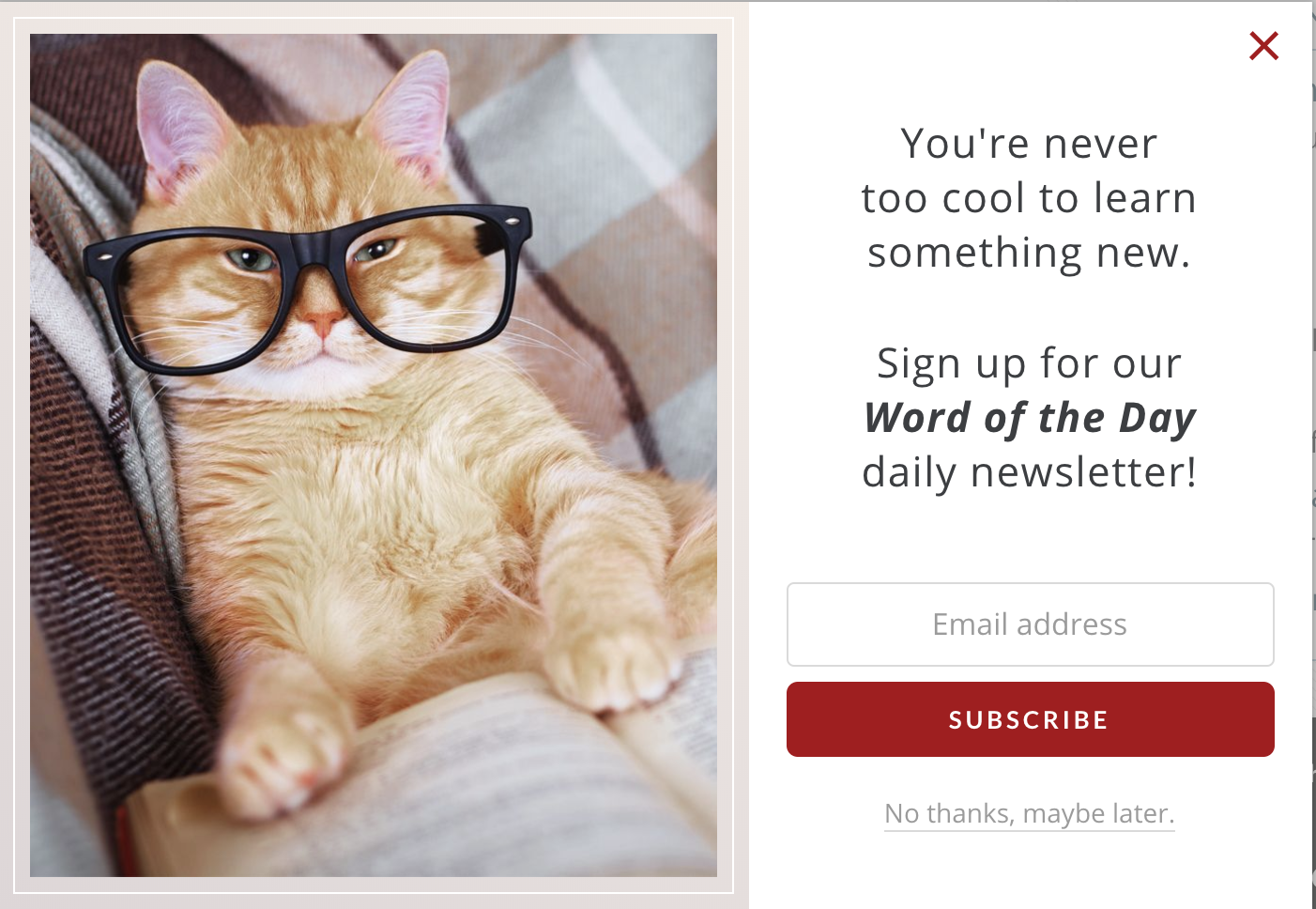
Merriam-Webster’s approachable and no-pressure opt-in form.
It’s a pretty cool opt-in form, right? Merriam-Webster’s Dictionary puts the “too cool for school” attitude to sleep and makes you feel good about learning something new each day. (Bonus points for the hipster cat, too!) Now, imagine if instead of “No thanks, maybe later”, the microcopy there read “No, I’d rather stay boring.” Which one of the two would you choose: the neutral and no-judgment approach that makes refusing an option… Or the sarcastic, condescending attitude that makes bouncing from the site so much more appealing by the second? (I know which one I’d go with.) We’ve barely scratched the surface but hopefully, with these 4 tips, you can now start making better decisions when it comes to your microcopy.Over to You
Got any microcopy stories to share about brands or apps that completely blew you away with those subtle yet oh-so-human touches in their forms or error pages? Share them in the comments below and let us know! Ralitsa (goes by Rali) is a sales copywriter and digital strategist for visionary humans who want to make a difference with their professional services, courses, and SaaS products. True to her curious nature, when she’s not writing copy for her awesome clients, she’s teaching herself web development and UX design.
Website: https://ralitsaminkova.com/
More From Ralitsa Minkova on UXNewsMag.com
3 Simple Ways to Boost Your Marketing With UX Design Principles
Ralitsa (goes by Rali) is a sales copywriter and digital strategist for visionary humans who want to make a difference with their professional services, courses, and SaaS products. True to her curious nature, when she’s not writing copy for her awesome clients, she’s teaching herself web development and UX design.
Website: https://ralitsaminkova.com/
More From Ralitsa Minkova on UXNewsMag.com
3 Simple Ways to Boost Your Marketing With UX Design Principles
Note that images from Mailchimp and Meriam-Webster are used under the “Fair Use” doctrine of limited, transformative use to comment on a particular piece of rights-reserved work.


One thought on “Microcopy: The Key to Delightful UX Design (and How to Get It Right)”